
A look back at returns during the pandemic
- tim@emorningcoffee.com

- Sep 7, 2021
- 8 min read
Updated: Sep 8, 2021
“Invest for the long-term.” – Lou Simpson (former GEICO CIO, sub of Berkshire Hathaway)
I published an article two weeks ago in E-MorningCoffee that presented quarterly ETF sector returns during the pandemic and over longer periods. This article, which you can find here, showed how 11 different sectors in the US equity markets had come into or fallen out of favour during the pandemic period. As a follow-up, I decided to examine the returns of several broader equity indices and other asset classes over similar periods. This information is mainly to get you to think about the undercurrents that will drive markets and financial asset prices in the coming months.
For the sake of conformity, I have mainly used the same indices and asset classes that I update weekly in E-MorningCoffee, which are listed below:

I calculated returns for the last six quarters (1Q20 to 2Q21 inclusive), as well as for FY2019 (last pre-pandemic year), FY2020 (pandemic year) and 2021YtD (through August 31, 2021). I also included returns since the pandemic lows on March 23, 2020. Lastly, I included CAGR (compound annual growth rate) for 5-, 10- and 15- (pre-GFC) year periods, and since the turn of the century (end of 1999, pre-tech bubble). These returns exclude dividends on the equity indices. Whilst dividends might not generally be a significant component of total returns for equities, you should note that they are nevertheless additive, meaning they are incremental to the returns I am showing. The dividend yields vary rather materially between indices, too. For example, the dividend yield of the FTSE 100 for 2020 was 4.12%, whereas the dividend yield of the S&P 500 for 2020 was only 1.58%. As you might expect amongst the US indices, the DJIA – a more concentrated index of more mature companies – has a higher dividend yield (2.23% in 2020) than the Russell 2000 (1.39% in 2020), reflecting the differences in the components and construction of each index.
In the second part of this article, I look at returns for fixed income asset classes, including corporate (credit) bonds and US Treasuries. For these fixed income asset classes, I looked at total returns, inclusive of interest payments.

Historical data was slightly more difficult for me to find as far as fixed income, so I have separated the return information and discussion between corporate bonds (including investment grade and high yield) and US Treasuries.
As a final caveat before diving into the return data, please note that I am presenting returns that are not risk adjusted and are presented in local currency (as opposed, for example, being adjusted to US Dollars for non-USD indices). You might expect over longer periods of time that riskier asset classes should deliver higher returns. If markets are efficient, returns when risk-adjusted for the various asset classes should be relatively in line, but I did delve this deep for purposes of this article. I am also not speaking to matters involving portfolio construction, namely correlation risk, across the various asset classes.
Equity indices and other asset classes (excluding fixed income)
The two tables below contain return information for equity indices and other asset classes that are included each week in the E-MorningCoffee weekly update. For the equity indices, I have highlighted the best performing index for each period by category in green, and the worst performer for the period in red (noting that red does not mean the return was necessarily negative for the period).


There are many interesting points to note when looking at this data. Some of the more interesting ones that jumped out for me included:
Globally as far as developed markets, the best performing index during the pandemic has changed depending on the quarter, with the S&P 500 (twice), the emerging markets index (twice), the Shanghai index (once) and EUR STOXX 600 (once) all featuring during the six quarter period. The worst performing indices by quarter over these six quarters have been the Shanghai index (three times), the FTSE 100 (twice) and the Nikkei 225 (once).
Sticking with the global indices, the S&P 500 was the best performer during FY2019 (pre-pandemic), FY2020 and 2021YtD. The worst performer in both FY2019 and FY2020 was the FTSE 100, and the worst in 2021YtD has been the emerging markets index.
Since pandemic lows, the S&P 500 has experienced the most significant recovery (+102.1% through Aug 31, 2021), whilst the Shanghai index has experienced the weakest (+33.2%). However, since the end of 2019, the only global index that I track that has still not recovered lost ground is the FTSE 100, which remains 5.6% below its 2019 year-end close.
To make matters worse of UK investors, the FTSE 100 has been the worst performing index over most longer periods too. As of August 31, 2021 (close 7,119.70), the index is only 2.7% above its level at the turn of the century (6,930.20) more than 20 years ago, a miserly CAGR over the period of 0.1%/annum. Having said this, keep in mind that the FTSE 100 has also traditionally had the highest dividend yield vis-à-vis the other indices I am presenting. Since 2000, the FTSE 100 has had an average annual (arithmetic) dividend yield of 3.49%, whilst the S&P 500 has had an average dividend yield of 1.87%. This might pull the FTSE 100 off the bottom, but I did not look at this in detail because my instinct is that any way you slice it, the FTSE 100 looks to be a perineal underperform.
Turning to the US indices, the NASDAQ has been the star performer as far as US indices for the last six quarters aside from a stumble in 1Q2021. However, rather surprisingly it is the “value proxy” – the Russell 2000 – which has had the best performance since pandemic lows, outperforming the NASDAQ over this period.
With its focus on growth, the NASDAQ has perhaps not surprisingly also been the best index to own amongst the US indices, at least since the tech bubble burst in 2000-01. If you look at the CAGR over various periods, you will see that the magnitude of outperformance since 2006 has been significant. Not only has the outperformance of the NASDAQ vis-à-vis the other indices been significant, but the differential has been increasing consistently over time as the NASDAQ has gained momentum.
Although gold lost its lustre beginning in 4Q20 and has been largely range-bound since then, the precious metal has delivered solid returns since the end of 2019 and since pandemic-lows. As with most asset classes, the return is a matter of when an investor bought gold. Over longer periods of time, gold has delivered a good return (and it adds diversity and risk that is largely uncorrelated with equities).
The US Dollar, which has provided investors with positive returns over long periods since the turn of the century, has weakened since the darkest days of the pandemic as investors shifted into riskier assets, including other (riskier) currencies, as government and central bank support became clearer.
WTI crude, which plummeted during and just after pandemic lows in late March 2020, has served up positive quarters ever since as the global economy gradually regained steam (acknowledging that the price has stalled since end of 2Q21). Keep in mind that perhaps more than any asset I am discussing in this article, oil prices are influenced by a combination of factors on the supply and demand side that are truly unique to oil.
The star asset performer over its relatively short life has been Bitcoin, a fair proxy for cryptocurrencies overall. As the table illustrates, Bitcoin has massively outperformed all of the other assets I track in every quarter – aside from 2Q21 – since the end of 2019.
Fixed income
In this section, I present returns for USD-denominated investment grade-rated (BBB) corporate bonds, USD- and EUR-denominated high yield bonds, and US Treasuries. All of the bond returns are total returns, meaning that they include coupons payments and price changes, whereas the equity indices I presented earlier were for price changes only (ignoring dividends).
I will first look at corporate (credit) bonds.

As might be expected, USD- and EUR-denominated high yield bonds have outperformed USD-denominated investment grade bonds over longer periods (reference right four columns in table above), which should be expected given the higher risk profile (and associated volatility) of high yield vis-à-vis investment grade bonds. However, investment grade bonds were the star performer in both 2019, the year prior to the pandemic, and during the pandemic year. The 2019 improvement in corporate bonds across the credit spectrum was due to a combination of a decrease in UST yields and credit spread compression. The yield of the 10-year UST (constant yield) decreased from 2.66% at the beginning of 2019 to 1.92% by the end of that year, which had a larger impact on investment grade bonds because of the percentage of the coupon dependent upon the underlying yield (rather than the credit spread). Moving to 2020, investment grade was again the star performer, benefiting both from the indirect further decrease in UST yields and the re-introduction of the Federal Reserve’s quantitative easing programme in March 2020 to combat the pandemic-induced recession. The primary market and secondary market corporate bond facilities of the Federal Reserve were open to investment grade bonds, fallen angels and high yield ETFs, but not to individual high yield bonds, providing investment grade bonds with an edge. As US Treasuries moved off of their late summer 2020 lows, returns on corporate bonds moderated. Similar to the effect on prices being more favourable for investment grade bonds when yields are falling, the effect is more detrimental for investment grade rated bonds as underlying yields increase. Credit spreads have been fairly steady, as the outlook in terms of defaults – even for more risky high yield bonds – remains favourable. In this context, my opinion continues to be that it is investment grade bonds that remain most vulnerable to increases in UST yields.
Turning to US Treasuries, US government bonds rallied across the maturity curve in both 2019 and in 2020, with the latter period benefiting from the quantitative easing programme implemented in 1Q20 by the Federal Reserve to address the economic harm caused by the pandemic.
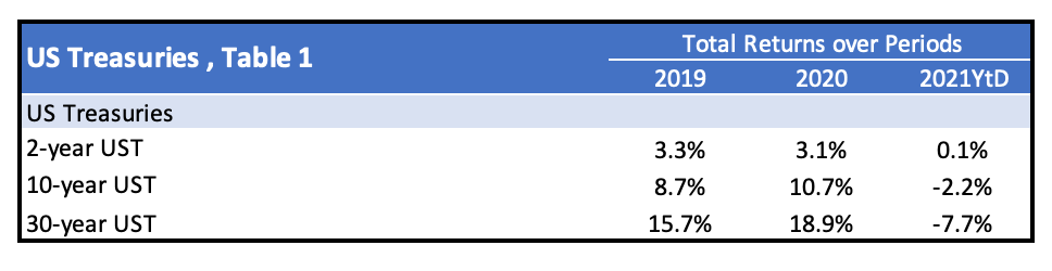
When yields came off of their late summer 2020 lows and as the yield increase gained momentum in early 2021, USTs sold off harshly. This was most pronounced in 1Q21. For example, the yield on the 10-year UST (constant maturity) increased from 0.93% at the end of 2020 to 1.74% by the end of the 1Q2021. Yields then settled down over the ensuing months, retracing back to a rangebound area by mid-July (1.25%-1.35% for the 10-year for example), which has persisted so far. Still, the damage was largely done for UST investors in 2021 in the first quarter.
The table below, from a different source, provides total returns over a longer period for both the 10-year US Treasury and 3-month US Bills. Negative return years for 10-year bonds are denoted in red.

This table is interesting for two reasons. Firstly, it illustrates how poor returns have become at the short end of the curve since the Federal Reserve introduced its unconventional monetary policies during the GFC of 2008-09. Secondly, it illustrates the fairly wide range of returns in any given year on longer-dated USTs. You can see in the table that there have been five years of negative total returns over this 30 year period, and four of these have been 8% losses or more. It is well known now that pure market forces no longer determine yields, but rather policies of the Federal Reserve. Where we will go from here is anyone’s guess.
The performance of the asset classes I discussed in this article perhaps provide some insights for you to develop your own views as to where we might go next. Like it or not, the “loftiness” of financial assets is likely to remain highly dependent on the fiscal spending by governments and the actions – many rather unconventional as of late – of central banks. This makes the challenge of predicting where we might go next even more difficult.
**** Follow E-MorningCoffee on Twitter, and please like and comment on my posts right here on my blog. You need to be a subscriber, so please sign up. Thanks for your support. ****


Comments